
Pie Charts Considered Helpful (Sometimes)
The usefulness of pie charts continues to be a very contentious issue in VIS, because of the long shadow of Cleveland and McGill’s experiments that led to VIS’s modern theory of “effectiveness.” I’m not really here to criticize that study, because I think it’s actually pretty good. I do think the theory is far from complete. It’s been 40 years. We can do a lot better.
Anyways, pie charts and bar charts can be more or less useful than each other depending on task at hand. For example, in Cleveland and McGill they use this pie chart as a bad example of pie chart usage, because it is difficult to read precise values or do precise comparisons between those values. (I have included a reference bar in the bar chart so that you can (hypothetically) visually discern the ratio of each bar to the whole sum.)
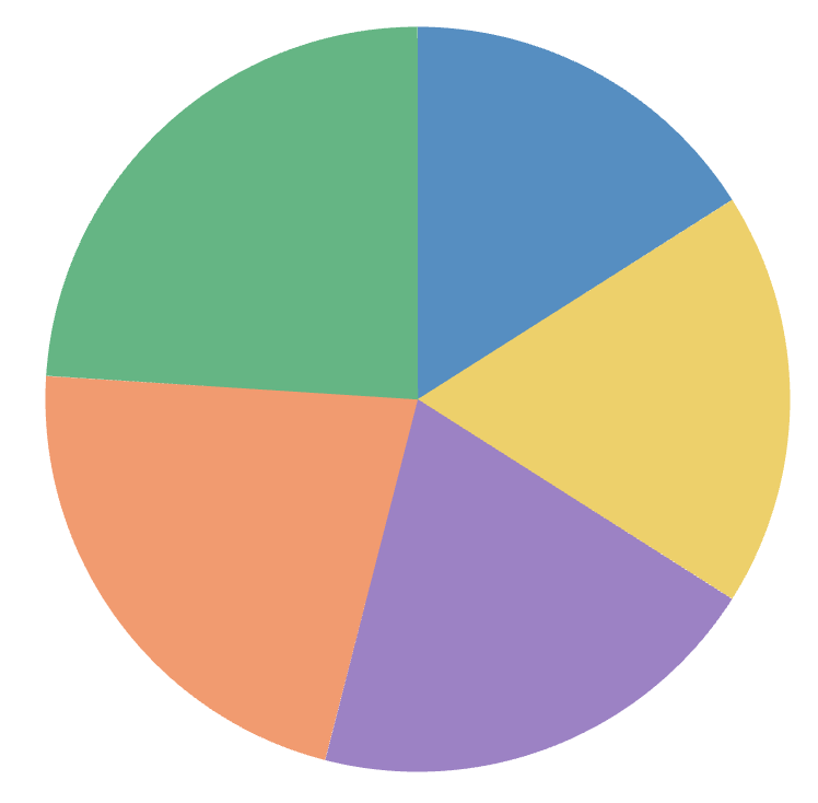
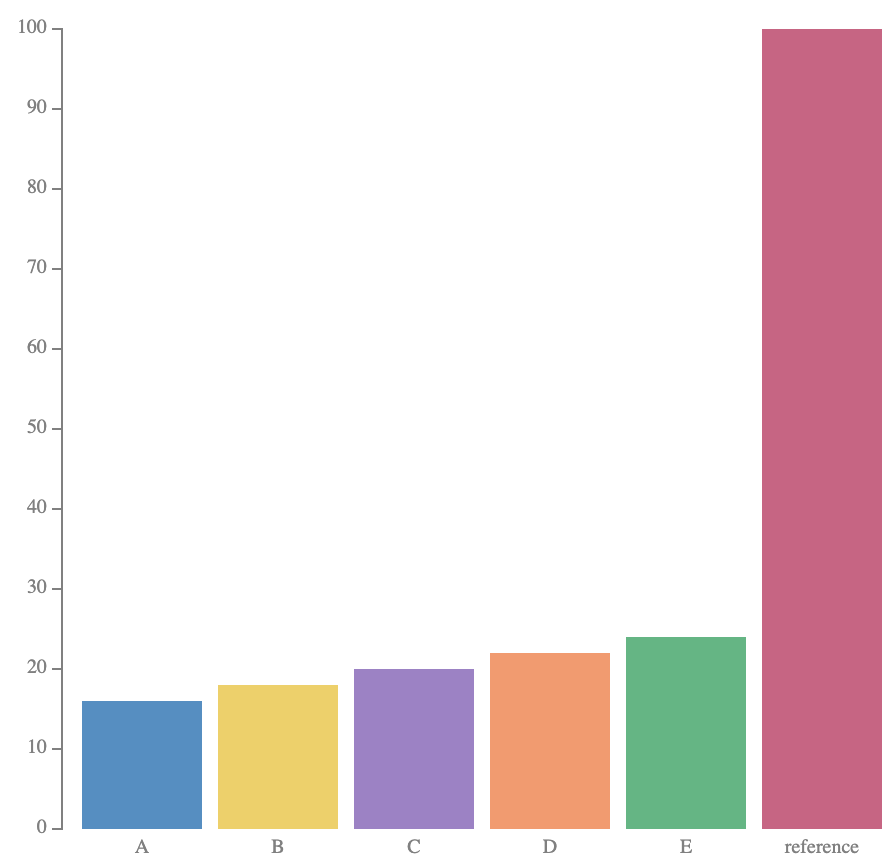
On the other hand, if your task is to judge at a glance the rough proportion of each category, pie charts can do much better. Already in the example above, we can see that each wedge is about a fifth of the pie, with the green wedge looking to be nearly a quarter.
Here’s a more extreme example of that:
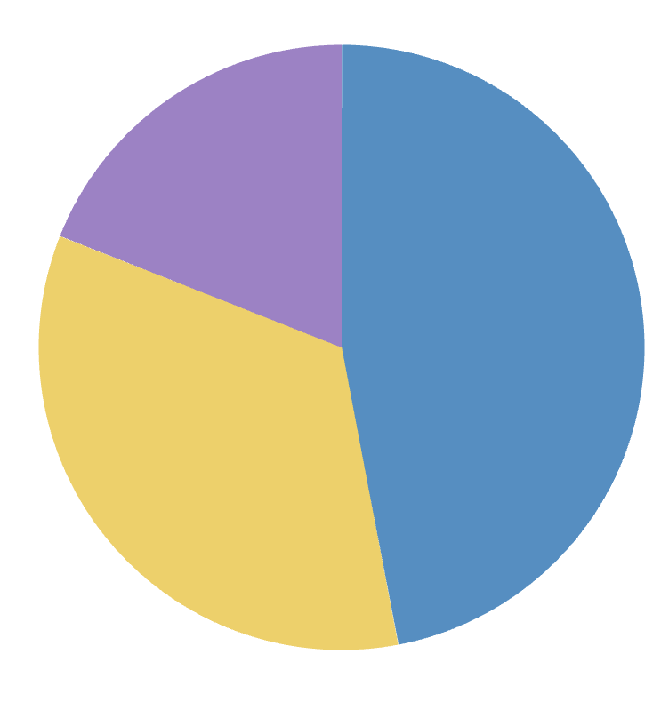
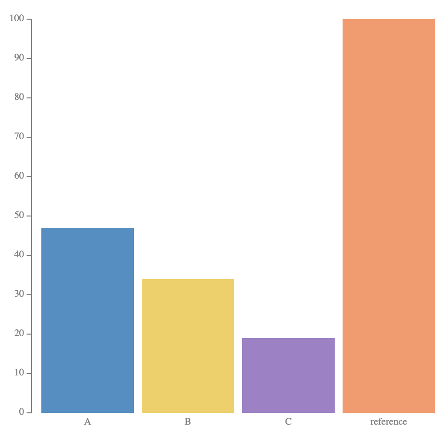
At a glance in the pie chart, we can see that the blue region is just under 50%, the yellow region is about a third, and the purple region is about a fifth. We are familiar with what these angles look like and it becomes a discrete recognition problem. In the bar chart on the right, this comparison is much more difficult, and would require that we introduce grid lines or read off the axis to make this comparison. It’s not as visually salient.
I think this is also why scatter pies are a useful chart type: because pie charts are much more glanceable, especially at small scales. Take a look at this scatter pie from Ashjian et al. 2017:
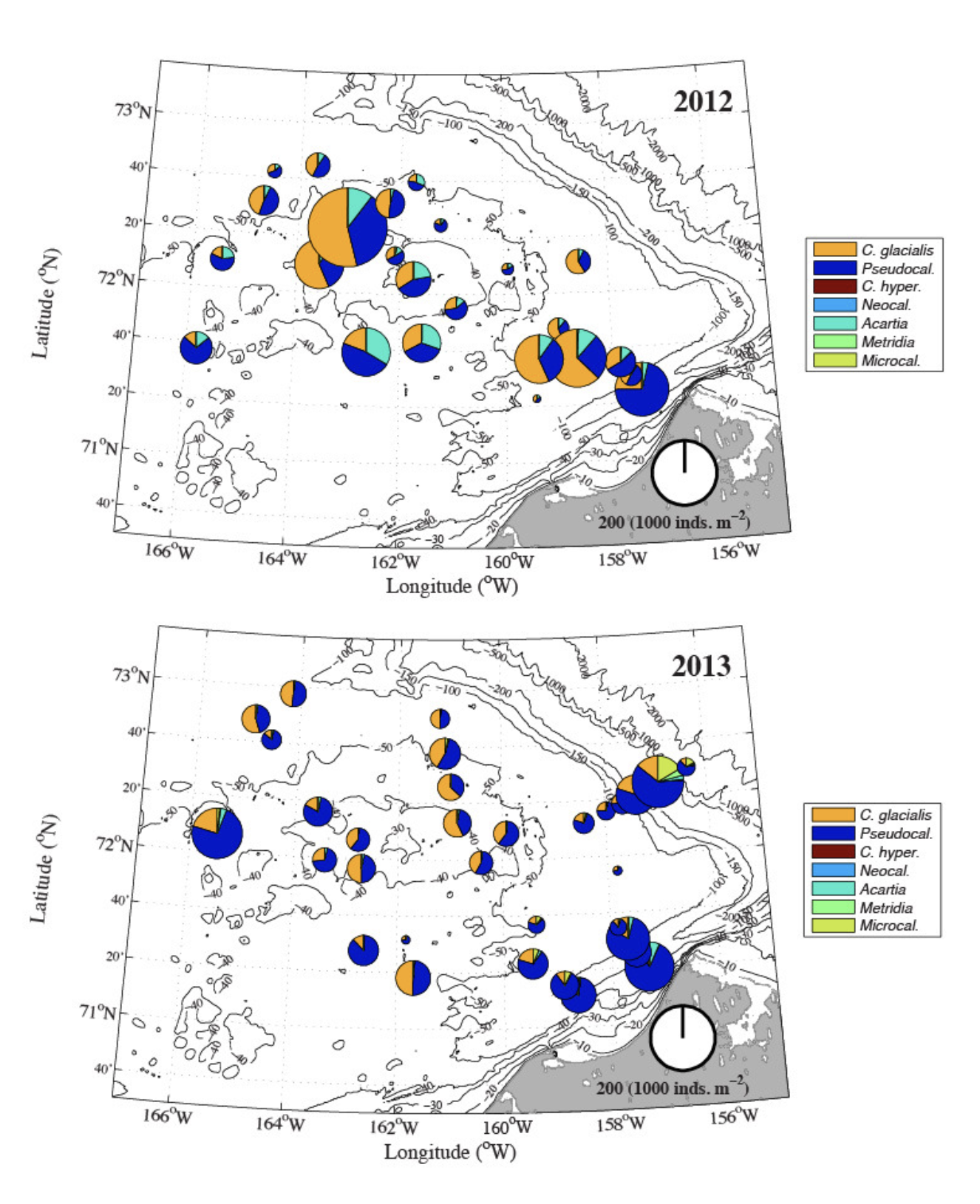
See how the different proportions of blue, orange, and cyan pop out?
Cleveland and McGill’s Mistake
I would love to have a theory of how we read statistical graphics that can explain this decision more systematically. Traditional visualization “effectiveness” as described by Cleveland and McGill is clearly insufficient, because it only considered accuracy.
The thing is that Cleveland and McGill almost caught themselves, but just missed it.
One must be careful not to fall into a conceptual trap by adopting accuracy as a criterion. We are not saying that the primary purpose of a graph is to convey numbers with as many decimal places as possible. We agree with Ehrenberg (1975) that if this were the only goal, tables would be better. The power of a graph is its ability to enable one to take in the quantitative information, organize it, and see patterns and structure not readily revealed by other means of studying the data.
Reasonable enough so far! They go on to say
Our premise, however, is this: A graphical form that involves elementary perceptual tasks that lead to more accurate judgments than another graphical form (with the same quantitative information) will result in better organization and increase the chances of a correct perception of patterns and behavior.
Maybe if correctness is our only criterion this is true? But really by their logic this would get us back at tables again… So what’s going on? I think we can start by regularizing the accuracy criterion. If our only goal is to read to like the closest 10% from a graphic, there are situations (as above) where pie charts are just as accurate as bar charts. However, they are much faster to read than bar charts and likely require less cognitive load.
If we don’t regularize accuracy, then we fall into the “conceptual trap” of “as many decimal places as possible.”
See also this article by Nick Desbarats (and many other articles I haven’t seen or am too lazy to dig up again) that discuss this pie chart issue.
Thanks to the CU Boulder vis folks and Dylan Wootton for inspiring me to write this up.